UVA Health Logos
Logo Color Options
Preferred Full Color Logo

The full-color, CMYK, or RGB logos are preferred. Use CMYK for any print use such as collateral or business papers. Use RGB for digital use such as Powerpoint presentations, web or broadcast/video. See color specifications.
White Knockout Logo

The white knockout logo is a versatile logo that can be used in both print and digital applications. It is best used on color of adequate contrast or photographic backgrounds where the preferred full-color logo will not work.
One-Color Logos

One-color logos are available in UVA blue and black. They can be used in places where the full-color logo might not work, such as on an orange background or with more limited printing or application techniques, such as embroidery, screen printing, grayscale or one- color printing.
Whenever possible, the UVA blue one-color logo should be used. Use the black one-color logo only when the navy would be illegible.
Incorrect Logo Usage
Our logo is one of our most important assets and should be protected. As such, it should not be altered under any circumstances. The logo should be treated as artwork: Always use the original logo files and do not attempt to recreate it yourself using text. Here are some examples of things to avoid when using our logo:
Do:
-
Use correct approved logo artwork
-
Use common sense
Don't:
-
Use logo images obtained from non-approved sources such as the Internet
-
Make your own logo files
-
Manipulate our logo files
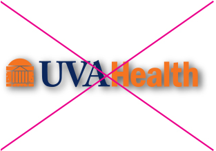
Do not add a drop shadow or other effect to our logo.
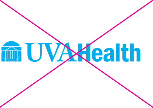
Do not use any colors other than UVA Orange and UVA Blue.
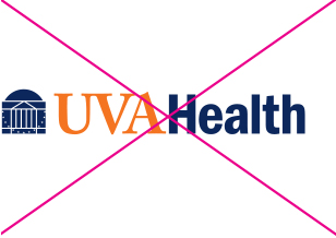
Do not manipulate our approved color formats.
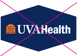
Do not place our logo in a container.
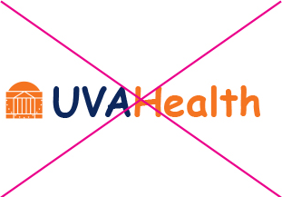
Do not change our font.
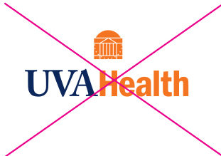
Do not rearrange the elements of our logo.
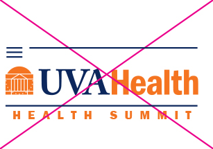
Do not add elements to our logo. Follow clear space guidelines.
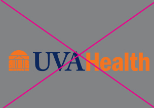
Do not place our logo on a color that does not provide adequate contrast.
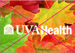
Do not place our logo on an image that is overly busy.
Minimum Logo Size
To ensure visibility, reproducibility, and legibility, our logos must be sized appropriately.
Do:
-
Use our logo at an adequate size
-
Use a logo size, when possible, consistent for the application
-
Ask if you don’t know
Don't:
-
Use our logo smaller than illustrated here
-
Size our logo unproportionately
-
Squeeze our logo into tight spaces

In Print, the logo must be no less than 1.875" wide. For digital use, no less than 180px wide.
Required Clear Space
Our logo should be surrounded with clear space (not to be confused with white space) to ensure its visibility and readability. Clear space on all sides should be equivalent to the height of the Rotunda.
Do:
-
Allow ample space around the logo
-
Allow more clear space than recommended when possible
-
Ask if you don’t know
Don't:
-
Place our logo too close to text, graphics or imagery
-
Position the logo too close to the edge of an application
-
Crop our logo

UVA Health Entities
Logo Lockups
A logo lockup is when the organizational logo is combined together with an offering to create a new signature. Logo lockups are limited and may only be created with the approval of the Office of Strategic Marketing and Communication.
Approved offerings, such as entities, medical centers and specialty hospitals, may be “locked up” with the organizational brand. All other offerings are not approved for a logo lockup, unless a special exception has been made.
Proportion
Using the height of “U” in the UVA Health logo equal to x, the size of the lockup text is equal to half that height or 0.5x. The distance between the UVA Health logo and the lockup text should be a distance of 0.5x.
Lockup Configuration
The vertical space between lines of type is called leading. Please note that when locking up two or more lines of text with our logo, the font size must equal the leading size (e.g., 40 pt=40 pt). Default leading is often set to 120% of font size, so always double-check.


Approved Logo Lockups
Logo lockups have been approved for these offerings and may be used to represent them. All others must use the UVA Health logo, unless exceptions have been approved. See the previous page for exceptions approved for signage only.


UVA Health Children's
UVA Health Children's Logo
UVA Health Children’s encompasses our pediatric offerings and programs. The signature, special marks, color palette and typography use a modified version of our visual identity for a look and feel that is appropriate for children and families, while still aligned with UVA Health as a whole.
These are the UVA Health Children’s preferred logos. The logos should be used in the preferred color format whenever possible to represent UVA Health Children’s.
Preferred Color Logo
The full-color CMYK or RGB logos are preferred. Use CMYK for any print use such as collateral or business papers. Use RGB for digital use such as PowerPoint presentations, web or broadcast/video. See color specifications.
White Knockout Logo
The white knockout logo is a versatile logo that can be used in both print and digital applications. It is best used on a primary or secondary UVA Health Children’s color or photographic backgrounds where the preferred full-color logo will not work.
White Logo On Blue

Split-V Logo
UVA Health team members may use the split-V logo for promotional items like t-shirts, fleeces and other wearable items. The UVA Health logo must also be present on the item whenever the Split V is used.
- Ex: UVA Health logo on front of shirt, split V on back.
Guidelines
The Split-V logo typically utilizes a two-color format – the “V” should appear in UVA Orange and the “name” should appear in UVA Blue. One-color split Vs may be available in certain scenarios.
For ease of eligibility, use no more than 12 characters within the split V. If the name exceeds this limit, a two-line Split-V with 12 or fewer characters on each line will be used.
All Split-V logo requests will be determined by UVA Licensing and approved by marketing based on branding guidelines.
